Why Are There So Many Green Gildan G500 Shades? (The Only Gildan G500 Green Shade Selection Guide You Need)

Posted by AllDayShirts on to T-Shirt Color Guides
If you have ever surfed the web looking around for bulk t-shirts, odds are you probably have come across the Gildan G500. It’s a wholesale t-shirt staple and a favorite for many t-shirt printers and designers for its reliability and affordable nature.
In addition to its popularity, you probably also noticed the insane amount of colors the Gildan G500 is offered in. Green, for example, the color that is up for discussion in this post, has 13 different shades by itself. Color overkill is what you might be thinking to yourself right now. But in reality, offering that many colors is very important for a multi-faceted color like green, especially if it is going to be utilized in a design by someone like a t-shirt printer and designer.
Green, the Color with Many Meanings
Green is a very complicated color for the fact that just altering its tone or how light or dark it is can dramatically change what it means symbolically.
Light green, for instance, generally has a positive connotation as it’s representative of nature and symbolizes freshness, health, and growth as a result.
If you’ve ever watched an advertisement for some sort of medication or relief substance you may have noticed the usage of a lot of light green colors on the branding of the product itself and the surrounding environment. This is because light green has a comforting element that is very appealing to your eyes, giving green a subliminal healing effect. Light green is also the inverse of bright red, a universal symbol for danger apparent in everyday things such as traffic lights. This allows light green to give off a feeling of safety, the opposite of danger.
Now if you were to tweak green into a darker shade then all of those aforementioned qualities would completely change.
That’s because the most commonly associated thing with dark green is money. It makes sense. Money runs the world so its dark green color might as well be symbolic of money itself.
Since dark green is associated with money, it tends to symbolize all of the things that money is associated with as well. As a result, dark green is symbolic of positive things like ambition but also much more negative things like envy and greed.
Completely different feelings from light green right?
Even changing the tone of green by introducing another color to it can drastically alter what the color represents.
Take for example a yellowish-green. Just by adding a yellow undertone to the base green color, the color is more symbolic of poor health and sickness.
Small changes in the underlying features of color can really make a huge difference.
Green Gildan G500 Selection Guide
As previously mentioned, making slight changes to the features of the color green can have huge implications on what the color means symbolically. This is very important if you’re a t-shirt designer and printer creating a t-shirt design to express some sort of idea or message.
Equally as important to consider as a t-shirt designer and printer is how that color will interact with other colors if a design is being placed on it.
That’s why we created the following guide. It will provide a brief description of each shade of green as well as what colors it works best with and not so much.
So here is the only green Gildan G500 shade guide you’ll need for all of your t-shirt printers and designers out there.
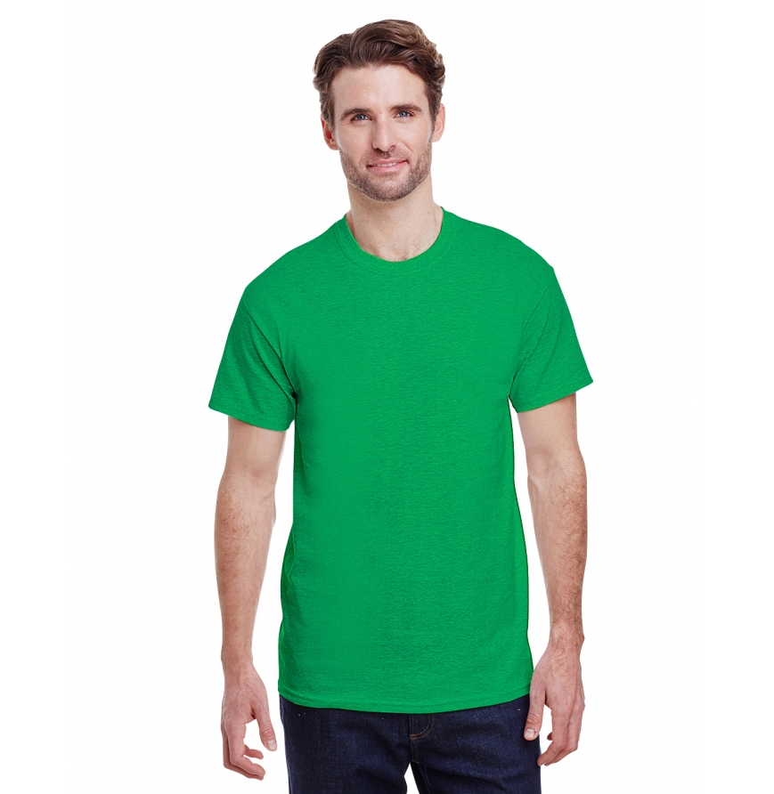
Antique Irish Green Gildan G500

Antique Irish Green is based on the traditional green used in many Irish designs. If you’re looking for the perfect color for all your St. Patrick Day designs, this is a great choice. Consider pairing it with colors that you would also find on a leprechaun such as a red-orange or black.
Works Well With Red-orange and black.
Don’t Pair With Purple or dark red.
Antique Jade Dome Gildan G500
Antique Jade Dome is a sort of green and blue hybrid. It’s a very comparable color to teal and works with the same colors that you would pair with a teal. Gold and Antique Jade Dome is one of our favorite combinations, but it also works great with coral, white, and gold.
Works Well With Coral, white, gold, and brown.
Don’t Pair With Red, light blue, light purple, and other greens.
Electric Green Gildan G500
Electric Green is a super vivid and bright color. It’s more suited as an accent to design because of its overwhelming nature. The color goes extremely well with any shade of pink due to the stark contrast it provides but it’s quite limited in its capabilities to complement other colors. It does also work well with a black, however.
Works Well With Any shade of pink and black.
Don’t Pair With Red (unless it’s holiday season), blue, orange, purple, and yellow.
Forest Green Gildan G500
Forest Green is a very inviting color, extremely comfortable for your eyes to rest upon. This is a very versatile color and can really pair with any soft tone color if executed properly. Just don’t go about combining it with any neon yellows or other extremely bright colors.
Works Well With Soft tone colors like soft pink.
Don’t Pair With Bright colors.
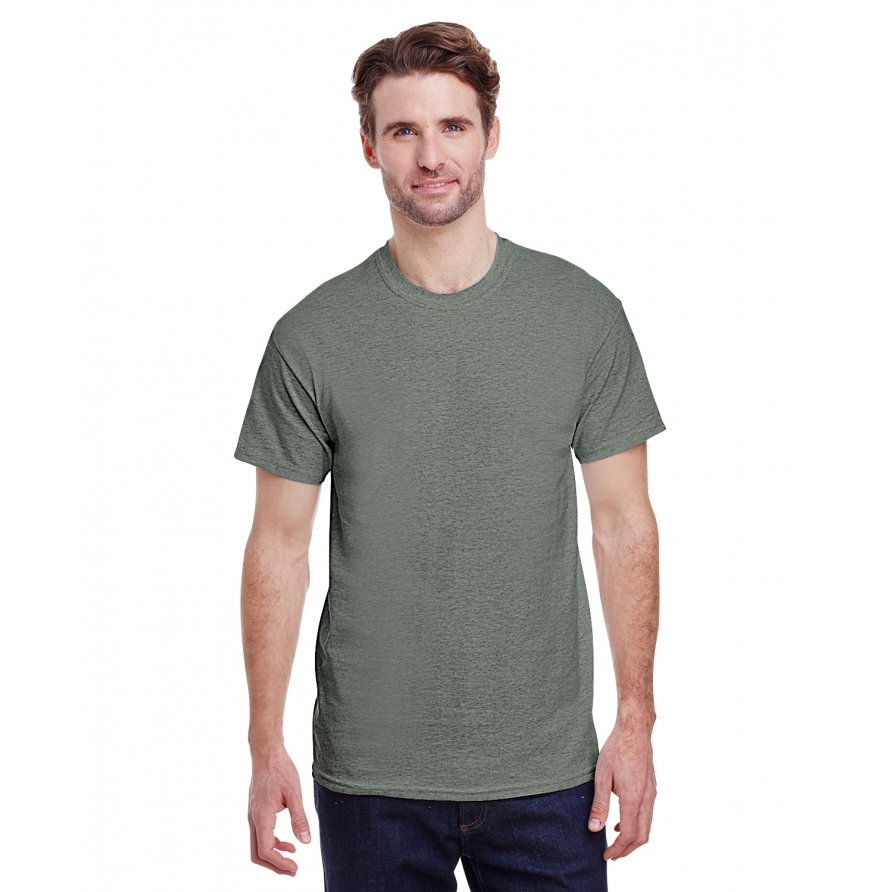
Heather Military Green Gildan G500

Heather Military Green is like a neutral gray with a hint of dark green in it. It goes great with other neutral and Earth tones. Cream, beige, brown, and black are all great options to pair with Heather Military Green.
Works Well With Neutral and Earth tones.
Don’t Pair With: Anything other than neutral colors and Earth tones are quite risky to combine with Heather Military Green.
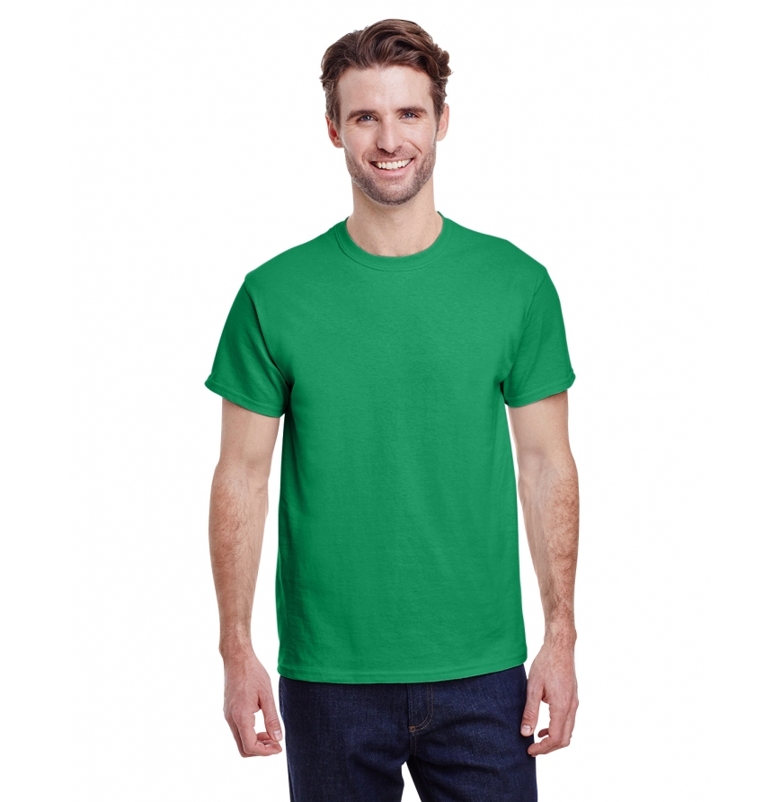
Irish Green Gildan G500
Irish Green is very similar to its Antique Irish Green counterpart. The only difference is it’s a bit darker and less faded. They are practically interchangeable in terms of color compatibility so it is just a matter of preference in terms of what to choose. Maybe considering using Antique Irish Green for more vintage designs and regular Irish Green for more vivid ones.
Works Well With Red, orange, and black.
Don’t Pair With Purple or dark red.
Kiwi Gildan G500
Kiwi is a soft color, comparable to a greenish bronze. This is a color that works well as an accent to even darker green like a Military Green. It works very well with gray, black, and dark green. An interesting color to pair with Kiwi is Fuchsia.
Works Well With Gray, black, darker greens, and Fuchsia.
Don’t Pair With: Bright colors usually don’t work with Kiwi but there are some exceptions like Fuchsia.
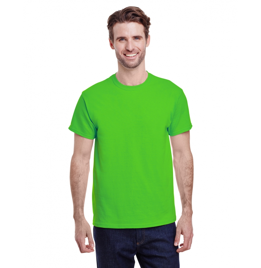
Lime Green Gildan G500

Lime Green is the classic light green color. It adds liveliness to a design with its light and vivid nature. It works extremely well when providing contrast with dark cool colors such as deep purple and dark blue. Lime Green also works well with duller colors like gray.
Works Well With Darker and duller colors like a deep purple, gray, or peach. Can also work well with super vivid colors as well like a Hot Pink.
Don’t Pair With: Intermediate colors that aren’t bright or dull do not really mix well with Lime Green.
Military Green Gildan G500
Picking Military Green over Heather Military Green is just a matter of preference. They are both pretty much compatible with the same colors, however, Military Green just has a more apparent green undertone compared to Heather Military Green.
Works Well With Neutral and Earth tones.
Don’t Pair With: Anything other than neutral colors and Earth tones are quite risky to combine with Heather Military Green.
Mint Green Gildan G500
Mint Green is a very gentle shade of green that gives off a soft and comforting feeling. It goes very well with other gentle colors like peach or baby blue. We would recommend not mix it with any bold colors like dark blue or red.
Works Well With Soft gentle colors like peach and baby blue.
Don’t Pair With: Bold colors like dark blue and red.
Neon Green Gildan G500
Somewhat comparable to Lime Green, Neon Green genuinely mixes and matches with the same colors. It’s not as light as Lime Green, but it’s equally as bright if not brighter. Contrast it with some duller colors like gray, or pair it with some vivid ones like Hot Pink.
Works Well With Darker and duller colors like a deep purple, gray, or peach. Can work well with super vivid colors as well like a Hot Pink.
Don’t Pair With: Intermediate colors that aren’t bright or dull do not really mix well with Electric Green.
Safety Green Gildan G500
This is a pretty specific use color. It’s the color you would find on a crossing guard's vest or a construction worker's uniform. It goes with silver and black but is a very limited color in terms of mixing and matching with others.
Works Well With Silver and black.
Don’t Pair With: It’s very difficult to pair with any other colors besides silver and black.
Turf Green Gildan G500

Turf Green comes from the common shade of green used on sports fields’ turf. It’s pretty standard green with a little bit of dullness to it. Works great with Football Sunday colors like white and brown. This color is perfect for a gameday design.
Works Well With White and Brown.
Don’t Pair With: Bright colors like yellow and bright red.
Main Takeaway
Overall, we hope that your main takeaway from this is to really research what colors you plan on buying, especially for bulk t-shirt orders. Having so many color options is great, it allows for unlimited creativity and plenty of opportunity for your designs, but they also need to be taken seriously as altering a color just a little bit can have huge consequences.
- Gildan vs. Bella+Canvas vs. Next Level: The Decorator's Ultimate Blank T-Shirt Guide (2026)
- Christmas Fun Starts with Custom Hoodies & Crewnecks Using DTF Printing
- Thanksgiving DTF Apparel: Create Cozy, Colorful, and Custom Looks This Holiday Season
- Halloween DTF Apparel: Create Spooky Custom Looks with Jerzees 562 and 996 from AllDayShirts.com
- The Ultimate Guide to Soft Style Gildan Fleece: Comfort, Style, and Value for Every Wardrobe
- Why Acrylic Beanies Are a Unique Challenge
- Jerzees Fleece: The Perfect Blend of Comfort, Style, and Value
- Back-to-School DTF Printing: The Ultimate Guide to Custom Apparel for Students and Schools
- Image Enhancer for DTF Printing: How to Unlock Sharper, Brighter, and More Professional Prints
- How to Apply UV DTF: The Complete Step-by-Step Guide


