10 Best T-Shirt Color & Ink Combinations for Custom Designs

Posted by AllDayShirts on to T-Shirt Color Guides
Did you know that learning about the color wheel can help bring your t-shirt designs to the next level?
You don't have to be a color theory expert to come up with awesome t-shirt designs, but knowing the basics can help your work stand out. The color wheel shows how colors are organized. It is the best tool to use when deciding on t-shirt color & ink combinations.
So, if you want your custom t-shirt designs to look cool and professional, you've come to the right place. Keep reading to learn more about 10 of the best t-shirt color & ink combinations backed by color theory and the color wheel.
Color Wheel Basics
Before diving into specific color combinations, let's go over some color wheel basics. Using tools like color palette generators can help you come up with many different combinations if you are not familiar with the wheel. However, this information is good to know, as it will make it a lot easier for you to come up with endless t-shirt design ideas.
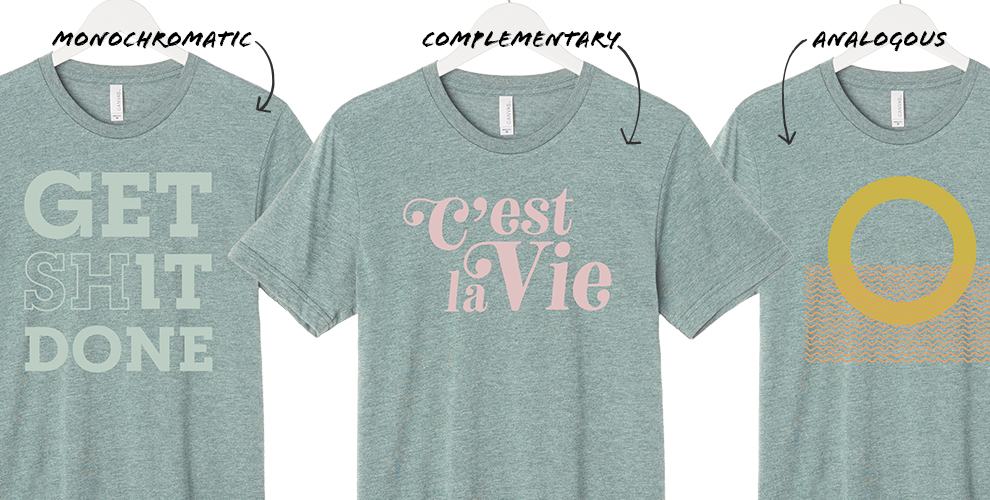
Source: BellaCanvas.com
Monochromatic Colors
The first important term in color theory is "monochromatic." Simply put, this refers to multiple shades of the same hue. For example, light green and dark green, light pink and dark pink, etc.
Complementary Colors
Complementary colors are those that are across from each other on the color wheel. For example, red and green, and blue and orange.
Analogous Colors
These are the colors that are next to each other on the color wheel. An example of this is red, orange, and yellow.
Split Complementary Colors
This is similar to complementary color combinations. However, instead of it just being two colors directly across from each other, this type of color combination includes one color and the colors on either side of its complement. For example, yellow, blue-purple, and red-purple.
Triadic Colors
This color combination includes three colors that are equally spaced out on the color wheel. For example, purple with green and orange.
Tetradic Colors
This is another color combination that requires colors to be equidistant. However, unlike triadic combinations, these include four colors instead of three. For example, red, green, blue-purple, and yellow-orange.
Now that you know the basic terms, let's explore some of the best t-shirt color combinations to bring your designs to the next level.
1. Light Blue and Navy
Light blue and navy is a monochromatic color combination. This color combo will have enough contrast to make your design pop, but it will look classy and elegant. Blue is a universally-loved color, so using this combination is a good idea if you are looking to create a unisex design.
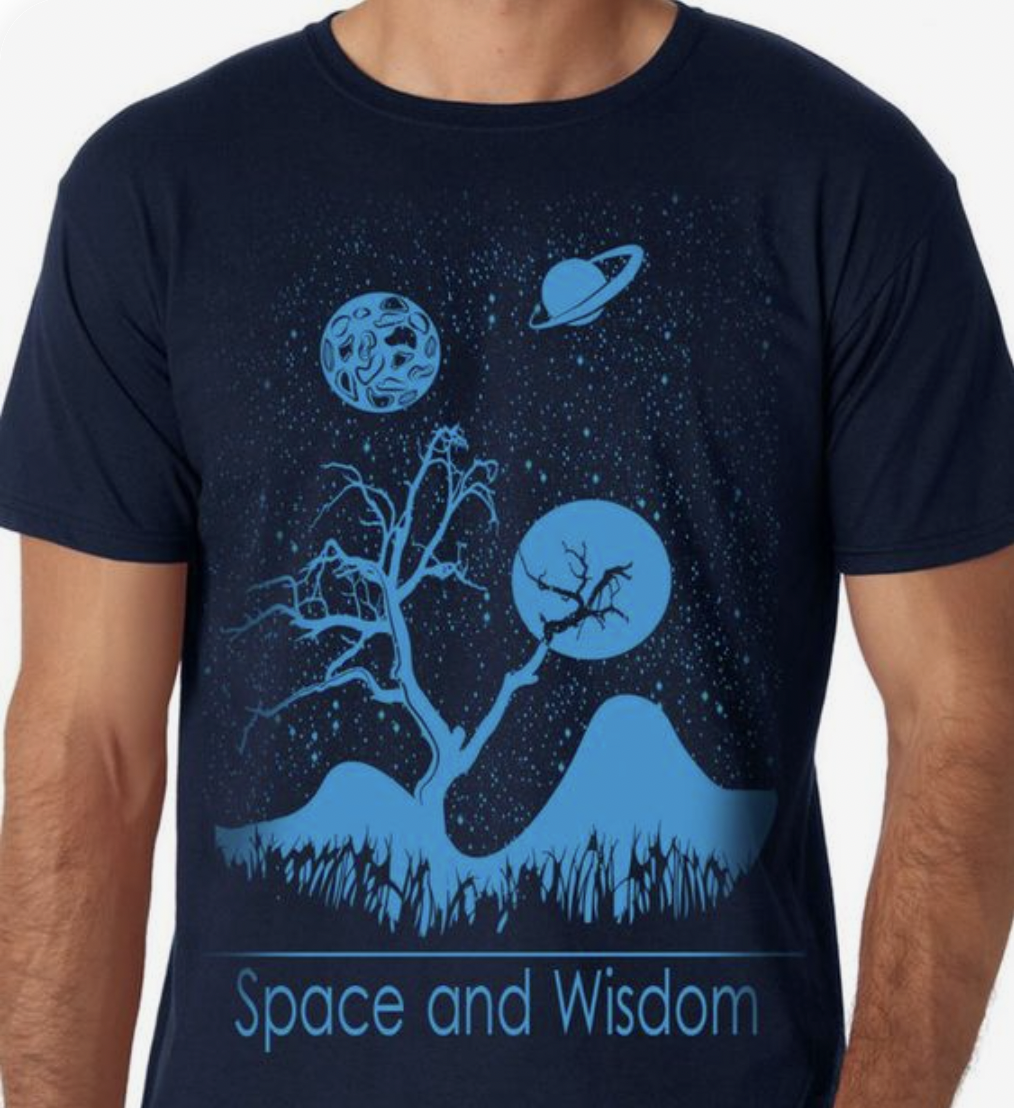
Source: Zazzle.com
2. Red and Maroon
Red and maroon is another classic monochromatic color combination. Both of these colors radiate warmth. This combination makes a strong visual impact, so this combination is perfect for bold designs.
3. White and Gray
White and gray is a very sophisticated and timeless color combination. Because both colors are neutral, they pretty much go with everything. This t-shirt color combination is foolproof. It is the perfect combination to go for if you are looking for one that will look classy and appeal to a large audience.
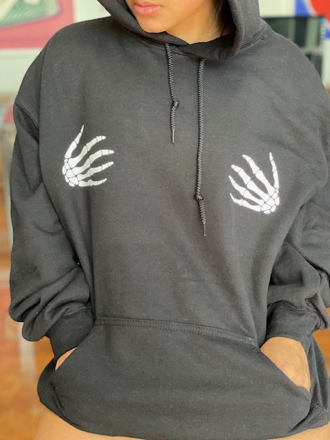
4. Yellow and Purple
Yellow and purple are a perfect combination if you are looking for contrasting colors. Because they are across from each other in the color wheel, these colors will make each other pop, making it a very fun and exciting combination for any design.
5. Blue and Orange
Blue and orange are also complementary on the color wheel. Because these colors contrast beautifully with each other, this is another fantastic combination to go with. You can play around with several different hues of each shade, and see what works best with your design!
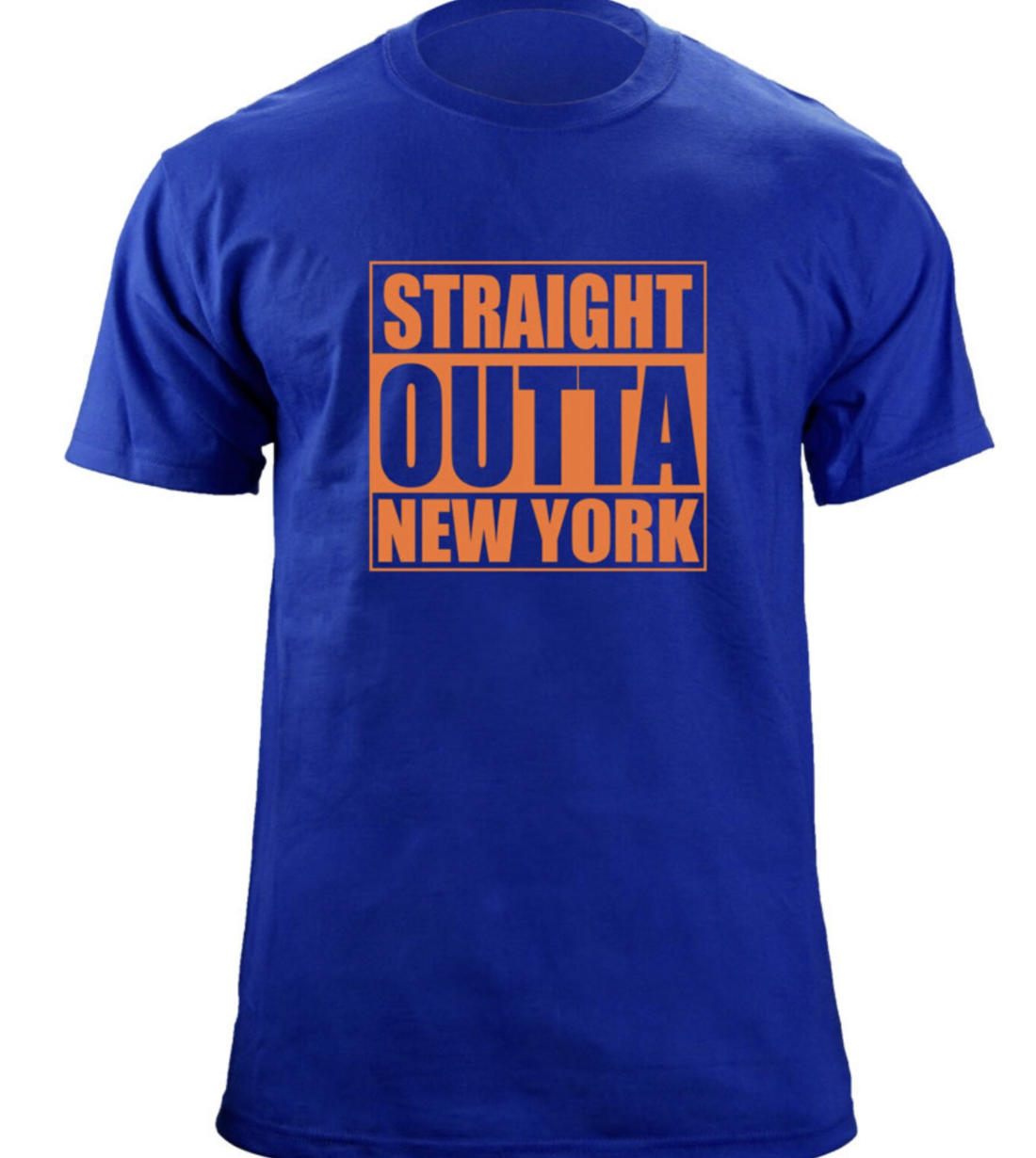
Source: Etsy.com
6. Red and Green
Red and green are also across from each other on the color wheel, making them complementary. Just like any combination of complementary colors, these two look great together.
This combination is classic for holiday designs, but you can play around with different hues of these colors if you don't want your design to look too festive.
7. Blue and Green
Blue and green are analogous colors. Because they are next to each other on the color wheel (they have blue-green in between them, but that is because it is a combination of the two), they look beautiful together.
For your design to pop, make sure to play around with the hues. A light blue t-shirt with dark green ink would look amazing. A green t-shirt with navy blue ink is another fantastic choice!
8. Orange and Red
Talk about a fierce combination! Orange and red are also analogous on the color wheel. Therefore, no matter what hues you pick, these colors will work well together.
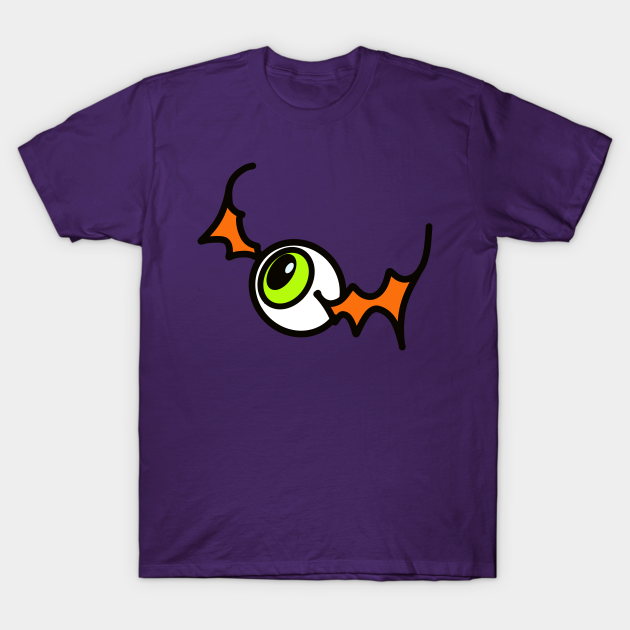
9. Purple with Green and Orange
If you are feeling like adding more than one color to your design, consider using a triadic color combination like this one. Purple, green, and orange look great together because of their relationship in the color wheel.
This is a fun color combination, often used for Halloween designs. However, if you don't want your design to remind people of this spooky season, try playing around with the different hues! You'll be surprised at how many unique combinations you can come up with using these three colors.
Source: Teepublic.com
10. White and Any Color in the Wheel
For a more classic design, consider using a white t-shirt and adding ink of pretty much any color. Although there are many shirt color options in the market, a white t-shirt is always going to be a solid choice.
As a rule of thumb, try to stay away from very light colors like pale yellow to make your design pop! Mid to darker hues always work best for white shirts.
Put These T-shirt Color & Ink Combinations to the Test
Now that you know some of the best t-shirt color & ink combinations, you can start designing custom t-shirts that stand out. So, what are you waiting for?
Check out our t-shirt catalog to start bringing your designs to life!
- Gildan vs. Bella+Canvas vs. Next Level: The Decorator's Ultimate Blank T-Shirt Guide (2026)
- Christmas Fun Starts with Custom Hoodies & Crewnecks Using DTF Printing
- Thanksgiving DTF Apparel: Create Cozy, Colorful, and Custom Looks This Holiday Season
- Halloween DTF Apparel: Create Spooky Custom Looks with Jerzees 562 and 996 from AllDayShirts.com
- The Ultimate Guide to Soft Style Gildan Fleece: Comfort, Style, and Value for Every Wardrobe
- Why Acrylic Beanies Are a Unique Challenge
- Jerzees Fleece: The Perfect Blend of Comfort, Style, and Value
- Back-to-School DTF Printing: The Ultimate Guide to Custom Apparel for Students and Schools
- Image Enhancer for DTF Printing: How to Unlock Sharper, Brighter, and More Professional Prints
- How to Apply UV DTF: The Complete Step-by-Step Guide


