

Posted by AllDayShirts on to T-Shirt Color Guides
If you were to go ahead and categorize each color of the rainbow, you’ll probably find that red is kind of the black sheep of the group. Every other color seems to be linked with positive and happy things like joyous rays of sunshine for yellow, peaceful clear skies for blue, and lively and fertile nature for green.
But not red.
Red is the universal color for danger. It’s the color of fire, it’s the color of our blood, and pretty much any object in our society that represents a stop or danger ahead. All these things may make it seem like red is a very unappealing color, but that’s not the case at all. Red is actually considered the second most popular favorite color behind blue and can be seen all around us on clothing, billboards, makeup, and so many other things.
Why is this so?
Over the years, psychologists and many people in the realm of marketing have taken notice of a few psychological effects that red possesses. The main psychological effect that red has is how intense it is as a color. Its intensity is to the point that it can literally raise the blood pressure and heart rate of the people viewing it.
This creates a sense of urgency that causes the viewers to act more instinctually rather than through rational thought. Not only that, red induces feelings of eroticism in its viewers which is why it’s the primary color of lipstick, nail polish, and a lot of other makeup items. It's also why women models mostly wear red dresses and red clothing in general when featured in advertising.
When combining the sense of urgency that red gives off the with erotic feelings it potentially portrays, red really puts its viewers in a vulnerable state where they act much more off of their instincts and emotions rather than rational thought.
This is something that people in the realm of marketing attempt to capitalize on all the time. In an industry completely focused on maximizing the number of transactions when interacting with a potential customer, any potential edge will be utilized.
That’s why it’s super common to see commands that lead to transactions such as “Buy Now!” or “Call Now!” being displayed in humungous bold red letters. It may not put every single potential customer in that vulnerable state that red can create, but as long as a percentage of customers are affected by it, the bold red lettering did its job.
Red really has a whole bunch of practical uses in businesses whether it’s invoking an action or marketing a product. It’s a far-reaching color that even has uses in our industry in bulk t-shirts, and if you’re a t-shirt designer and printer you better know how to use it.
As mentioned earlier, red is extremely effective at captivating the attention of a viewer and influencing that viewer’s actions. These are extremely useful features that need to be utilized, especially in an industry filled with color utilization and design creation.
If you’re a t-shirt designer and printer, it’s likely that you have some sample designs of previous work or a general template that you show to your potential customers as a marketing tool. It’s also likely that you have a website where people place orders or interact with you to place an order. These are things that can be optimized with the addition of the color red to lead to more efficient customer acquisition.
First, consider adding red text to parts of your website that you really want people to click such as a phone number or the checkout section. As mentioned earlier, this is a very common trick used by marketing experts that has been battle-tested for years, so it should be a quick fix to your website if it’s not already being utilized.
In addition, having a general shirt design template that says “Your Design Here” in big bold red letters on a black or white background could help a lot as well. It’s an easy way to get the attention of a potential customer and can be utilized in a variety of ways such as linking it to an order template on your website.
Even for your sample designs, consider throwing in some more samples with designs on a bold red t-shirt or feature some more designs that use primarily red. These will further stimulate the potential customer and make the design come off as more appealing. Be sure to not go overboard, but definitely feature some designs where red is the dominating color.
One of the great things about red is it’s a versatile color that can be altered to fit designs with different themes while still maintaining its important psychological effects.
For example, here are 5 different shades of red that the Gildan G500, a best selling t-shirt, comes in included with their thematic meanings and potential applications.
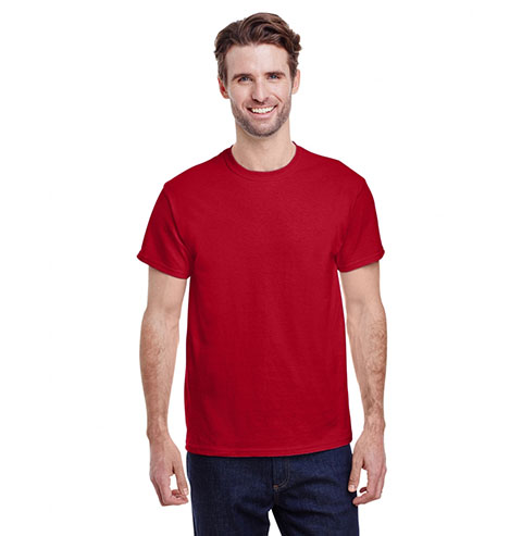
This is the typical red color that you are used to seeing. As explained earlier it's linked with attraction and danger and can really make a design. When it comes to what theme you are trying to convey with just the standard color red, context is everything. When used on a black background it can pop with exuberant flair and give off a sense of mystery and strength. Consider using that color combination for more bold designs that really want to stick out and show a sense of power and stability. Putting the red on a white background your red will have a softer and gentler feel on the eyes and provides a way to use standard red on subtler designs.
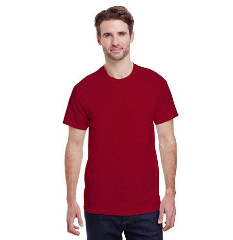
This dramatic yet natural shade of cherry is elegant and beautiful. It looks a bit faded so it has great use for vintage designs or on designs that are faded purposely. It’s faded nature also gives it a more innocent look that makes the color more approachable while still potentially evoking erotic feelings in its viewers.
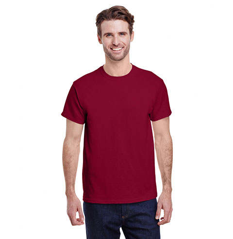
Also called just Cardinal, this is a collegiate favorite worn across the world. It’s great for college designs and sports team designs as it gives off a feeling of prestige and boldness.
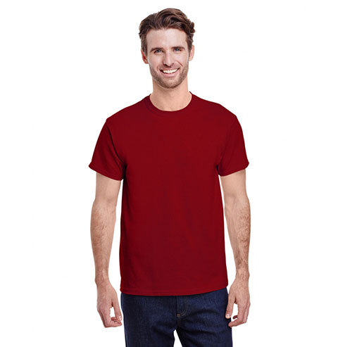
Named after a deep red gemstone, Garnet is considered a majestic color. In many cultures, the garnet stone is related to higher thinking and self-empowerment. This red is good for darker designs with powerful statements as garnet gives off feelings of strength and empowerment.
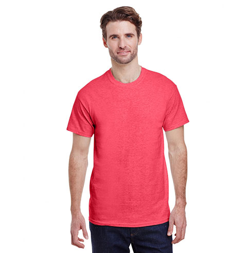
The lightest red in the Gildan G500 selection this works really well with neutral colors like gray. This a much more subtle and approachable red and can be used for faded vintage designs and more subtle and lighter designs.
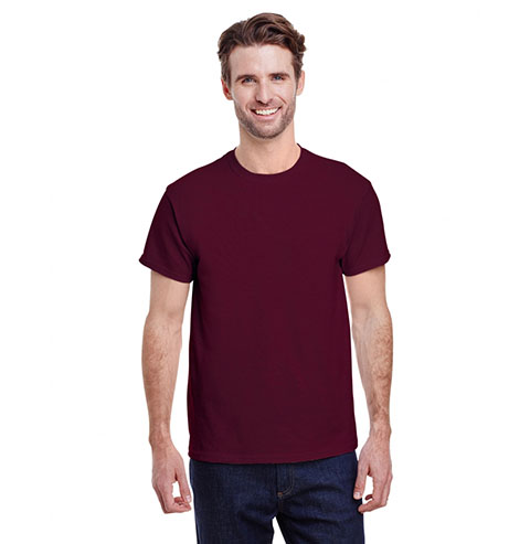
A hybrid between red and brown, maroon is symbolic of passion, intensity, and love. This a good color to put for any designs containing a heart or any heartfelt and passionate message/design.
All in all, red is a very useful color in the world of business, especially in any design industry. Conducting research and understanding how your colors work with each other on the canvas can really lead to success in business. You just have to put the work in.
Feel free to check out our other color blog posts for a full guide on how to utilize every color group correctly in your designs.